- Home
- Tutorials
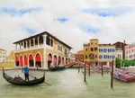
- Venice Grand Canal
- Preparing your drawing
Page 2: Preparing Your Venice Drawing
Credit: This tutorial series is based on original work by Peter Weatherill, restructured and expanded for Pencil Topics.
Preparing Your Venice Drawing
Before any colour touches the paper, we need to do some careful groundwork.
This stage isn't as exciting as painting, but it's the difference between a scene that looks right and one that looks slightly "off" for reasons you can't quite pin down.
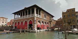
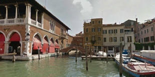
The Reference Photo
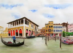
Our Venice scene is a composite. It's built from several photographs of the Grand Canal near the Rialto Fish Market, combined into a single composition.
The main elements are the ornate buildings on the left, the shadowed buildings and bridge on the right, the gondolier in the foreground, and that beautiful stretch of water tying it all together.
If you're assembling reference photos of your own, this is a perfectly legitimate approach. Very few artists work from a single photograph exactly as the camera captured it.
You're creating a composition, not copying a snapshot. You don't have to include everything the camera shows, and you can add elements for interest.
For more on working from photographs, including what you can and can't legally use, see my guides on using photo references for drawing and UK copyright law for artists.
Dealing with Perspective Distortion
This is the part that catches people out, especially when combining photos.
When you photograph buildings, the camera introduces distortion.
Wide-angle lenses exaggerate it, but even a standard lens will produce some. Lines that should be vertical lean inward. Roof lines don't quite align. Combine two or three photos taken from slightly different angles, and the distortions multiply.

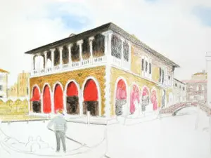
The red lines in this image show where the problems are. If you trace the original photos exactly as they are, your drawing will look wrong even though you can't immediately explain why.
Our eyes are very sensitive to verticals that aren't quite vertical, especially in architecture.
The fix is straightforward: before you start drawing, correct the major distortions in your reference. Make sure:
- All verticals are truly vertical. This is the most important one. If a building edge leans, straighten it.
- Horizontal lines (roof lines, the tops of arches, window lines) should converge gently toward their vanishing point, following the rules of perspective. They should not jump or shift where two photos have been joined.
- The horizon line should be consistent across the whole composition.
You don't need to be fanatical about this. Small inconsistencies disappear into the detail of the finished painting. But the major structural lines need to feel right.

Transferring the Image onto Your Paper
The reference photos and outlines are available as a single PDF file:
Venice project combined references
Once you're happy with your reference composition, you need to get the outline onto your watercolour paper. There are several ways to do this:
The grid method is probably the most reliable. You draw a grid over your reference (or a printed copy of it) and a matching grid on your paper, then transfer the key points square by square. It's methodical and accurate, and it works well for a complex scene like this.
Tracing paper works if your reference is printed at the same size as your final drawing. Trace the main outlines, flip the tracing paper onto your watercolour paper, and transfer by pressing firmly or rubbing the back.
A lightbox lets you place your reference underneath your watercolour paper and trace directly. This works best with lighter weight paper, so it may not be ideal for 300gsm stock.
Whichever method you use, keep your outline light and simple. You don't need every window frame and decorative detail. Just get the main shapes, proportions, and positions right. The outline ensures that everything sits where it should. Fine details can be added later, working from your reference photos.
If you're using graphite pencil for the outline (rather than ink), the pencil lines will largely disappear under the first layer of watercolour pencil. Any remaining marks can be gently erased once the first colour layer has fully dried. Rougher paper is more forgiving with this than smooth paper.
A Note on Boat Placement
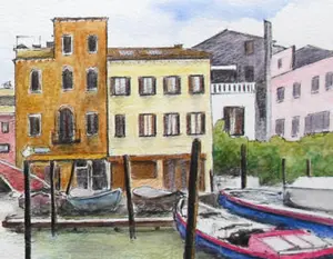
The composition includes a moored boat in the foreground that doesn't appear in all the reference photos.
If you choose to include it, make sure the waterline sits level with the quay. A boat that appears to float above or sink below the waterline will look wrong immediately, and it's hard to fix once the surrounding water is painted.

There's an alternative composition available in the PDF that places the boat differently. Choose whichever works best for your version of the scene.
Ready for Colour?
With your outline on the paper, you might be tempted to start painting straight away. Before you do, Part 3 covers something that will save you a lot of frustration: understanding how your colours mix and how they change when water hits them.
[Continue to Part 3: Colour Mixing with Watercolour Pencils →](colour-mixing-watercolour-pencils.html)
Venice Grand Canal Project Menu:
Overview & Materials : Preparing Your Drawing : Colour Mixing : The Sky : The Buildings : Water, Trees & Gondola : Finishing & Comparison

I'm Carol Leather, a coloured pencil artist for over 15 years. Most of my teaching comes back to the same idea: realistic coloured pencil starts with structure, light and observation long before the colour goes down.
My work has featured in Ann Kullberg's Color Magazine, CP Magic and Color Pencil Treasures (vol 7). I'm a member of the UKCPS and was a prize winner in the Nature section of their Annual Open Exhibition in 2020.
You might like these
Venice Watercolour Pencil Project: A Tutorial in 7 Parts
Draw a Venice Grand Canal scene step by step with watercolour pencils. Three brands compared, techniques explained, and every stage covered.
Painting the sky above our Venice scene
Painting the sky - the second page in our watercolour pencil tutorial featuring the Venice Rialto Fish Market scene
Finishing Your Venice Painting: Details and Brand Review
Final details, correction techniques, and a side-by-side comparison of the same Venice scene drawn with Derwent, Faber-Castell, and Staedtler pencils
Copyright © 2009- pencil-topics.co.uk All rights reserved
Home | About Us | Contact Us | Privacy Policy