- Home
- Tutorials
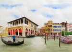
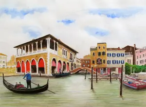
- Venice Grand Canal
- Water, Trees & Gondola
Page 6: Water, Trees, Gondola & Figures
Credit: This tutorial series is based on original work by Peter Weatherill, restructured and expanded for Pencil Topics.
Venice Grand Canal Project Menu:
Overview & Materials : Preparing Your Drawing : Colour Mixing : The Sky : The Buildings : Water, Trees & Gondola : Finishing & Comparison
Water, Trees, Gondola & Figures
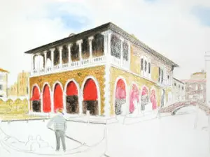
This is the part where your Venice scene starts to feel like Venice. The buildings give the scene its structure, but the water, trees, and gondola give it its soul. By the end of this page, you'll have all the main elements in place.
A practical note before we begin: in hindsight, it would have been wiser to paint the water before adding the dark mooring posts and gondola details. Dark pigment near the water's edge risks spreading when you wet the area around it. If you haven't added your dark posts yet, consider doing the water first. If you have, just work carefully around them.
The Trees
The trees in the Venice scene sit between the buildings, adding a welcome burst of organic shape among all the straight lines and hard edges. They break up the architecture and add depth.
Here's a method that produces convincing foliage:
Choose four or five greens. Not just one. Real foliage has a surprising range of colour, from yellow-greens catching the light to near-black greens deep in shadow. Select a light green, a mid green, a dark green, and add a brown or grey for the deepest shadows.
Apply the colours in overlapping circles or squiggles. Not careful, precise marks. Loose, overlapping circular motions that let the colours mix on the paper. This creates the random, organic texture that makes foliage look natural rather than painted.
Work from top to bottom. Start with the lighter colours at the top of the tree (where light hits) and work down toward the darker shades underneath and in the interior of the canopy.
Blend with a dabbing motion. When you apply water, don't stroke the brush smoothly across the foliage. Dab it. Short, gentle dabbing motions that blend the colours into each other without turning everything into a uniform green wash.


The limited 36-colour Staedtler set has fewer pale green options, which makes the foliage slightly less varied. If you have a larger set, you'll find more subtle greens to play with. But even with limited colours, the technique of overlapping circles with different tones creates convincing results.
For more on drawing trees in different contexts, see my how to draw trees guide and my watercolour pencil scribble tree tutorial.
The Water
Water is what makes Venice, Venice. And drawing convincing water with coloured pencils is enormously satisfying once you understand the principles.
The Grand Canal isn't blue.
Look at the reference photo. It's a complex mix of blue-green, grey-green, and reflected colours from the buildings and sky above.
The water nearest the buildings picks up warm tones from the stone. The centre catches more sky. The shadows under boats and along the quay are the darkest areas.
Step 1: Lay the foundation. Apply a grey-green wash as a base for the water area. Preserve the lighter areas in the centre where reflections catch the light. Don't paint them. Leave the paper.

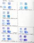
Step 2: Build the colour. Select pastel-toned colours, avoiding the centre highlight area for now. Layer six or so pencils in gentle applications, including white, to create delicate, shifting hues. The aim is subtle variation, not uniform colour.
Using the Derwent set, Smalt Blue and Cedar Green work well for adding depth in the darker areas. Apply these more firmly where the water is in shadow.


Step 3: Blend with horizontal strokes. This is crucial. Water reads as water because of horizontal movement.
Use a small bristle brush with short, horizontal strokes to blend the colour.
Vertical strokes will make it look like a wall. Diagonal strokes will look wrong.
Horizontal, always.

Step 4: Lift for texture. Use a pad of kitchen paper to selectively lift colour from the surface. This creates the subtle light-catching texture that makes water look like water. Short horizontal dabs with the paper, not long sweeping wipes.
Step 5: Build darker areas. Add deeper colour toward the bottom of the water area and in the shadows beneath boats and posts. Use short horizontal strokes with the pencil to maintain the water's horizontal character even in the dry work.

Tonal graduation in the water
As you build up the darker tones, keep the water closest to the viewer in a darker shade. This does two things.
It complements the vibrant hues of the buildings above, and it anchors the bottom of the composition with a band of shadow that gives the whole picture visual stability.
The lighter, brighter area in the centre where reflections catch the light then becomes the natural focus of the water, drawing the eye inward toward the buildings rather than letting it slide off the bottom of the page.
Step 6: Add reflections. Where buildings or objects reflect in the water, use gentle downward strokes to suggest the reflected shape, then soften with a clean, slightly damp brush.
Reflections in moving water are broken and fragmented, not mirror-sharp. A few interrupted vertical marks, softened and blurred, are more convincing than a careful reproduction.
For a deeper dive into drawing water, see my how to draw realistic water series and my page on drawing reflections.
The Gondola
The gondola is a strong, dark shape against the lighter water. It anchors the foreground and gives the scene its unmistakable Venetian identity.
For the main gondola: Gunmetal Grey and black form the base. The gondola's body is dark but not a flat, uniform black. Use the grey as a base and add black selectively for the deepest shadows. Add bright green accents for the traditional Venetian detailing.
For the second boat (right side): Darker red and a soft Delft Blue create a different character. Not every boat needs to be black. The variety helps the composition.

If the shape of your boat doesn't look quite right at this stage, don't panic. We'll cover correction techniques in Part 7. On 300gsm cold-pressed paper, you have options for fixing things that would be impossible on thinner paper.
For more on getting boats to look right, see my drawing a boat guide, which covers how to make a boat look like it's actually floating on the water rather than sitting on top of it.
The Gondolier
The gondolier is a small figure, but an important one. He brings life and scale to the scene.
Keep him simple. A few strokes of black and one or two vibrant accent colours for his clothing are enough. The temptation is to overwork small figures, adding features and detail that will just look messy at this scale. A confident silhouette with a splash of colour is far more effective than a fussy attempt at a portrait.
Where You Should Be Now
With the trees, water, gondola, and gondolier in place, your Venice scene should have all its main elements.
It won't look finished. There will be areas that need strengthening, details that need sharpening, and probably a few things you'd like to fix. That's what Part 7 is for.
Take a step back and look at the whole picture from a distance.
- What reads well?
- What looks weak?
- Where does your eye go first?
Make some notes before moving on, because it's easier to assess the picture now, while you can still see it with relatively fresh eyes, than after you've been working on details for another session.
The Final Stage
Time to bring it all together: finishing details, corrections, and a comparison of all three brand versions.
[Continue to Part 7: Finishing Touches & Brand Comparison →](venice-project-finishing-and-comparison.html)
Venice Grand Canal Project Menu:
Overview & Materials : Preparing Your Drawing : Colour Mixing : The Sky : The Buildings : Water, Trees & Gondola : Finishing & Comparison
This tutorial series is based on original work by Peter Weatherill, restructured and expanded for Pencil Topics.

I'm Carol Leather, a coloured pencil artist for over 15 years. Most of my teaching comes back to the same idea: realistic coloured pencil starts with structure, light and observation long before the colour goes down.
My work has featured in Ann Kullberg's Color Magazine, CP Magic and Color Pencil Treasures (vol 7). I'm a member of the UKCPS and was a prize winner in the Nature section of their Annual Open Exhibition in 2020.
You might like these
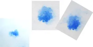
Painting the sky above our Venice scene
Painting the sky - the second page in our watercolour pencil tutorial featuring the Venice Rialto Fish Market scene
Venice Watercolour Pencil Project: A Tutorial in 7 Parts
Draw a Venice Grand Canal scene step by step with watercolour pencils. Three brands compared, techniques explained, and every stage covered.
Finishing Your Venice Painting: Details and Brand Review
Final details, correction techniques, and a side-by-side comparison of the same Venice scene drawn with Derwent, Faber-Castell, and Staedtler pencils
Copyright © 2009- pencil-topics.co.uk All rights reserved
Home | About Us | Contact Us | Privacy Policy