- Home
- Tutorials
- Venice Grand Canal
- Finishing & Comparison
Page 7: Finishing Touches & Brand Comparison
Credit: This tutorial series is based on original work by Peter Weatherill, restructured and expanded for Pencil Topics
Venice Grand Canal Project Menu:
Overview & Materials : Preparing Your Drawing : Colour Mixing : The Sky : The Buildings : Water, Trees & Gondola : Finishing & Comparison
Finishing Touches & Brand Comparison
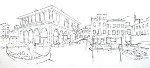
If you've made it this far, you have a Venice Grand Canal scene on your paper with all the main elements in place.
It might not look finished yet, and that's fine. This final stage is about refining, correcting, and adding the details that bring everything together.
Where Does the Eye Go?
Before you add any more marks, take a step back. Ideally, prop your picture up and look at it from across the room.
The most important thing to check is where your eye lands first. In a well-composed picture, the eye goes to the area of highest contrast, where the lightest lights meet the darkest darks. That's your focal point, whether you intended it or not.
Ideally, your focal point should sit near one of the golden section coordinates, roughly one-third across the picture and one-third up or down.
This isn't a rigid rule, but it's a reliable guide. If your eye is being pulled to the wrong place, that tells you where you need to adjust the contrast.
Tonal contrast (light against dark) is the strongest attention-grabber, but colour contrast works too. A small area of warm red against cool green, for example, will draw the eye even without a dramatic light-dark difference.
The Boat Problem
Here's a good example of how contrast can trick you during the process. The moored boat against the quay might have looked alarmingly prominent when you painted it. A dark hull against white paper creates strong contrast, and in isolation it dominates.
But now that the surrounding water, shadows, and quay wall are in place, that boat is probably sitting much more comfortably in the scene. What seemed like a problem has dissolved into the context of the picture. The eye has moved elsewhere.
This happens all the time in painting. Something that looks like a disaster in isolation turns out to be perfectly fine once the surrounding areas are complete. Which is why it's so important not to panic and overcorrect halfway through.
Correction Techniques
That said, sometimes things genuinely do need fixing. Working on 300gsm cold-pressed watercolour paper gives you more options than you might think:
Scalpel correction: Using the flat edge of a sharp blade, you can gently scrape away colour from the paper surface. The heavy paper tolerates this remarkably well. Work lightly with the flat of the blade, not the point, and don't press hard enough to tear the surface.
Resealing with white pencil: After scraping, the paper surface will be rougher than before. Apply white coloured pencil over the scraped area to reseal the surface. This smooths the grain enough that you can work over it again with new colour.
Lifting with clean water: A clean, damp brush can soften and lift some colour. Press a pad of kitchen paper onto the damp area immediately to absorb the loosened pigment. This works best for reducing intensity rather than removing colour completely.
Blotting excess: If you've just applied water and the colour is too strong, act quickly. A pad of dry kitchen paper pressed firmly onto the wet area will lift pigment before it settles into the grain.
None of these techniques will give you pristine white paper back. But they'll get you close enough to rework an area successfully. And on our forgiving 300gsm paper, you can use all of these methods without worrying about damaging the sheet.
For more on fixing problems in coloured pencil work generally, see my how to fix coloured pencil mistakes guide.
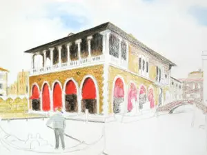
Adding Final Detail
This is the satisfying part. With all the foundations, washes, and major areas established, switch to dry pencil work with a sharp point for the finishing details.
Work your way across the picture, sharpening up:
- Window details and architectural features on the buildings
- The sharp edges of the mooring posts and gondola
- Horizontal wave marks on the water surface using short, controlled strokes
- Deepening shadows under eaves, beneath boats, and along the quay
- The gondolier's clothing and stance (keep it bold and simple)
Use a clean, slightly damp brush selectively to soften any dry pencil work that looks too crisp. You want some sharp edges (architectural details, the gondola) and some soft ones (water, distant buildings, sky transitions). The contrast between sharp and soft is what creates depth.
Final lifting can also help here. A barely damp brush pressed into the water area and blotted immediately with kitchen paper can create light points and sparkle on the water surface.
When to Stop
This is genuinely the hardest part. Every artist struggles with it. The temptation to keep refining, keep adding, keep "improving" is strong. But overworking a watercolour pencil painting kills the freshness that makes the medium so appealing.
Stop when:
- The picture reads clearly from across the room
- The focal point is in the right place
- The main shapes and values are correct
- You're starting to fiddle rather than improve
If in doubt, put it away for 24 hours and look at it with fresh eyes. You'll see immediately whether it needs more work or whether you've been overthinking it
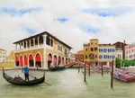
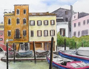
Three Brands, One Scene
Now for the comparison you've been waiting for. The same Venice scene, drawn three times with three different watercolour pencil brands.
Derwent Watercolour (72 colours)

- Pencils: 72 colours available
- Paper: Cold-pressed Clairfontaine Etival 300gsm
- Finished size: 16 x 10 inches
The Derwent pencils are soft and blendable, which makes them lovely to work with but means they need frequent sharpening for fine detail. The large colour range gives plenty of options without needing to mix extensively. Additional details were added in dry pencil to sharpen up the final result.
Faber-Castell Albrecht Durer (120 colours)

- Pencils: Selected from 120 colours available
- Paper: Cold-pressed Clairfontaine Etival 300gsm
- Finished size: 16 x 10 inches
The Faber-Castell pencils have a slightly drier feel than the Derwent, which gives you more control for detailed work. The enormous colour range (120 shades) means you can nearly always find the exact colour you want without mixing. The results are a touch more precise, a touch less loose.
Staedtler Karat (36 colours)

- Pencils: 36 colours
- Paper: Cold-pressed Clairfontaine Etival 300gsm
- Finished size: 20 x 11 inches (slightly larger)
And here's the surprise. The 36-colour Staedtler set, costing under £35, held its own against sets with three and four times as many colours.
The colours needed more mixing on paper, but that's not necessarily a disadvantage. Mixed colours often have more life and subtlety than straight-from-the-tin colours.
This version proves that a limited set doesn't have to limit your results. If you understand how to mix colours (which is why Part 3 of this tutorial exists), you can achieve far more than you might expect with a modest collection of pencils.
What the Comparison Tells Us
All three versions are worthy of a frame. The differences are there if you look for them, but none of them is clearly "better" than the others. What differs is the experience of using them:
- The Derwent pencils were the most enjoyable to use. Soft, responsive, forgiving.
- The Faber-Castell watercolour pencils gives you the most control and precision
- The Staedtler set proves that skill and understanding matter more than how many pencils you own.
Your version, with whichever brand you chose, will be different from all three of these. And that's exactly as it should be.
You Did It
If you've worked through all seven parts of this tutorial and you have a Venice scene on your paper, even an imperfect one, that's a genuine achievement.
You've tackled perspective, colour mixing, sky painting, architectural detail, water reflections, and foliage. Each of those is a skill that transfers directly into whatever you draw next.
And if some parts didn't turn out the way you'd hoped? That's not failure. That's information. You now know which techniques need more practice and which ones came naturally. That's worth far more than a perfect painting.
What to Try Next
If this project has given you a taste for bigger, more ambitious work, here are some places to go from here:
Daryl's Gondola Painting - a different artist's take on a Venice gondola scene, using mixed media. Lovely to compare approaches.
How to Draw Realistic Water - a three-part series that goes deeper into water techniques with coloured pencils
Drawing Reflections - more on capturing reflections convincingly.
Drawing Buildings - architectural drawing techniques beyond what we covered here.
Landscape Drawing Step by Step - a complete landscape tutorial in coloured pencil.
Underpainting Techniques - more on the grisaille and underpainting approaches we used for the right-side buildings.
Or head back to the watercolour pencils hub to explore more projects and techniques.
Venice Grand Canal Project Menu:
Overview & Materials : Preparing Your Drawing : Colour Mixing : The Sky : The Buildings : Water, Trees & Gondola : Finishing & Comparison
This tutorial series is based on original work by Peter Weatherill, restructured and expanded for Pencil Topics

I'm Carol Leather, a coloured pencil artist for over 15 years. Most of my teaching comes back to the same idea: realistic coloured pencil starts with structure, light and observation long before the colour goes down.
My work has featured in Ann Kullberg's Color Magazine, CP Magic and Color Pencil Treasures (vol 7). I'm a member of the UKCPS and was a prize winner in the Nature section of their Annual Open Exhibition in 2020.
You might like these
Venice Watercolour Pencil Project: A Tutorial in 7 Parts
Draw a Venice Grand Canal scene step by step with watercolour pencils. Three brands compared, techniques explained, and every stage covered.
Painting the sky above our Venice scene
Painting the sky - the second page in our watercolour pencil tutorial featuring the Venice Rialto Fish Market scene
Venice Buildings: Colour Foundations and Grisaille
Two approaches to painting Venetian architecture with watercolour pencils. Colour foundations for sunlit walls, grisaille underpainting for shadow
Copyright © 2009- pencil-topics.co.uk All rights reserved
Home | About Us | Contact Us | Privacy Policy