- Home
- Landscape drawing
How to Draw a Landscape in Coloured Pencils (From Your Own Photo)
What you'll learn
A working method for drawing a landscape from your own photo, by handling one part of the scene at a time instead of trying to wrestle the whole thing at once.
The first time I sat down to draw a full landscape, I picked the photo, opened my tin of pencils, and then stared. For about ten minutes. There was too much of everything: too many leaves, too many blades of grass, too much sky to keep one shade of blue, and a whole lot of green I didn't know how to mix.
I put the pencils away and went to make tea.
If that's where you are, looking at a photo you love and wondering where on earth to start, this page is the answer I eventually worked out. Not a recipe to copy, but a way to break the scene apart and look at the parts one at a time. The same approach works whether you're drawing from life or from a phone snap, with a starter tin of 12 colours or a wooden box of 120.
Packhorse Bridge at Allerford, from the step-by-step landscape tutorial
If you'd rather watch the whole method play out on a specific scene, the Packhorse Bridge step-by-step walks through one landscape from first pencil sketch to finished drawing.
Before you start: Treat your reference photo as a starting point, not a prison. You can move trees, leave out a fence, lift the sun a little higher, anything that makes the scene work better as a drawing. The point isn't to copy the photo. The point is to draw the landscape your photo points to.
Planning Your Landscape Scene
Before you touch colour, sketch a quick tonal thumbnail. Pencil only. Postcard-sized. You're not chasing leaves or bricks here. You're working out three things: what fits in the frame, what you'll leave out, and where the focal point sits.
Focal points usually land where the lightest light meets the darkest dark, slightly off-centre. If you want a wider grounding in composition basics, including the rule of thirds and visual balance, that's a useful detour before you commit pencil to paper.
If this sounds like skipping the fun part to do homework, I felt that too at first. But a five-minute thumbnail catches the composition problems that would otherwise show up halfway through a finished drawing, when fixing them means starting over. It's one of those things that feels like a delay until you've been burned once.
You can work from life or from a photo. Either way the thumbnail does the same job.
Getting the Light Right in Your Landscape
Why this matters
Light is what makes a landscape look real. Get the light direction wrong and even careful rendering of leaves and bricks will fall flat.
Light tells the viewer what matters. It pulls the eye to your focal point. It separates foreground from background. It tells us the time of day before we've worked out the subject.
In rural scenes, light usually comes from one main direction, softened by trees or hills. In town scenes, you might juggle street lamps, windows and signs, all casting their own little pools.
Either way, your first job is to notice where the light is coming from and what colour it is. Warm at sunrise and sunset. Cooler under a clear blue sky. Almost no colour at all on an overcast day.
If you want to go deeper into warm and cool colours, the colour theory section will get you started, then come back here to apply it to a landscape.
Drawing Trees with Coloured Pencils
The point
Draw the mass of a tree, not the leaves. Trees read as trees because of their overall shape and a soft, broken edge against the sky.
Landscapes often have trees, and trees can feel impossible if you try to draw every leaf. I used to do exactly that, and ended up with something that looked more like a green cloud on a stick than a tree.
The problem wasn't my pencils. It was where my attention was.
Start with the overall shape of the tree, or the mass of trees. Block in the trunk and main branches first. Then add clumps of foliage that form a soft mass, not a sharp outline.
The how to draw trees and foliage page walks you through this in detail.
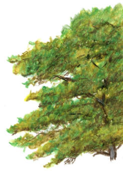
A watercolour pencil tree, worked as a mass rather than leaf by leaf
Use your eraser to pull out little sky holes where you can see through the foliage, and to soften the top edge so the tree doesn't end in a hard line. Both of those tiny moves do an enormous amount of work.
Season matters more than people expect. Spring needs light, almost olive greens. Summer is deeper. Autumn leans into yellows, ochres and browns. Winter shows bare branches against the sky, and you can lift snow out with a sharp eraser.
There's a step-by-step on a tree-covered hillside if you want to practise distant trees, and a single tree drawn with watercolour pencils if you want to slow right down and study one trunk in detail.
Drawing Grass, Weeds and Wildflowers
Foreground grass is where most people panic. The shorthand "just scribble some green" rarely looks right, and you can see why when you actually look at grass: it's full of shadows, gaps, browns, yellows, and blades crossing in front of other blades.
Start by blocking in the shadows dark enough to push the lighter blades forward. Vary your pencil pressure as you go so your darks still have colour shifts in them, never a flat black band. Let the grass overlap, bend and criss-cross. If every blade is the same height and direction, it looks like a green fence.
Closer blades can cast soft shadows across the ones behind them, which builds depth without much extra effort.
Foreground grasses worked in watercolour pencil, from the Brokken Bridge tutorial
The Brokken Bridge tutorial shows foreground grass worked in watercolour pencils. Peter's Garden Archway is a more intimate scene where the flowers themselves become the focal point, useful if you want a landscape that's smaller, closer, and quieter.
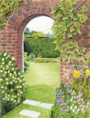
A garden archway scene where the flowers carry the picture
Drawing Skies and Clouds
Why this matters
A sky isn't "one blue". Graded properly, it's the thing that sets the mood of the whole drawing before the viewer notices anything else.
Look up on a clear day and you'll see the blue is deeper overhead and noticeably lighter near the horizon. If you draw the whole sky as the same shade, it flattens. If you grade it from rich-overhead to soft-near-the-horizon, it instantly looks like sky.
Light, even pressure makes it easier to lift out clouds with a sharp eraser afterwards. Cloud edges should be soft, not cut out with scissors. A hint of shadow under the base of a cloud tells us the sun isn't hitting it directly, but go too dark and clouds will look heavy and stormy when you didn't mean them to.
If you can, lie back in the garden or a park for a few minutes and watch the clouds. Notice how their shapes change overhead versus near the horizon. That kind of observation feeds straight into the drawing, much more reliably than any tutorial.
For a deeper dive, there's a page on different ways to draw clouds.
Clouds lifted out of a graded sky with watercolour pencils
Drawing Stone and Brick
Rocks, walls and buildings give a landscape structure. They anchor the scene against all the soft greens and skies.
Use scribbled or broken pencil strokes to suggest rough surface texture, but stay aware of where the light hits and where the shadows fall. Wet stones after rain may want smoother, burnished layers to look shiny. In dry weather, let some paper grain show through to suggest grit and dust.
The pages on brick and stone walls, plus the linear perspective guide, will help you avoid leaning buildings, a remarkably common problem and an easy one to fix once you've seen it.
Studio tip
I spent ages on a stone wall once, carefully rendering every crack and chip, and then realised I'd ignored the light completely. The wall looked flat in spite of all that detail. Light first, texture second. Always.
The Dartmoor Bowerman Stone tutorial shows how to combine rough rocks with softer fields and sky in one scene, which is a useful one to work through if your photo has a mix of textures.
A close-up of a dry stone wall, with light kept ahead of texture
Drawing Roofs
Roofs are the bit of a building that catches most people out, and it is the same trap as foliage and grass. You start trying to draw every tile, and the result looks busy and laboured before you are halfway up.
The shortcut is perspective and suggestion. A tiled roof obeys perspective in two directions at once, so each row of tiles converges toward two separate vanishing points rather than one.
Work out where those points sit before you draw a single tile. After that, suggest the tiles with a few well-placed darker rows, lighter ridges and broken edges, and let the viewer's eye fill in the rest.
Thatched roofs work the same way but with softer, fibrous strokes following the curve of the thatch.
The how to draw a roof page walks through both tiled and thatched roofs in detail, with examples of clay, concrete, slate and Mediterranean tiles, plus the two-point perspective set-up.
Drawing Water with Coloured Pencils
Rivers, ponds, lakes and sea all behave differently, but they share one rule: water reflects what's around it. It isn't "blue". It's tree-shapes, sky-shapes, boat-shapes, rearranged.
Calm water mirrors those shapes and colours fairly cleanly. Wind breaks the reflections into shifting, broken patterns. Look at your reference photo and draw the actual shapes you see in the water, not what your brain insists "water" should look like. The page on drawing water reflections goes deeper into how all this works.
If you're struggling, turn your reference photo and your drawing upside down. Suddenly you're looking at abstract shapes and colours, not "tree" and "boat", and your hand tends to draw what's actually there. It's the same trick old-school drawing teachers used for portraits, and it works just as well on water reflections.
An illustration showing how boat reflections sit in the water
Water features bring life to a landscape, and if your scene has a harbour, canal, river or lake you may want to add a boat. Here's how to draw one that looks like it's actually floating, not hovering an inch above the surface (which is the classic giveaway).
Feeling more confident? There's a full tutorial on painting a river through Dartmoor that brings all of this together in one finished piece.
Looking for more complex water tutorials?
- Realistic water: a three-part tutorial series (Part 2 | Part 3)
- Grand Union Canal: composing and painting a landscape (Part 2 | Part 3)
Putting it all together: a complete scene
Once you can handle the elements on their own, the real step forward is bringing several of them together in one drawing. Peter Weatherill's step-by-step of Alum Bay and the Needles is a lovely example: a soft, simple distance of pale chalk cliffs and sea set against a busy heather-and-gorse foreground, so depth, texture and a bit of restraint all come together in one scene.
Peter works it two ways, and the tutorial covers both: dry, with the colour taken straight from the pencil, or with a watercolour pencil wash laid in for the sky and sea first when you want a smoother start on a larger sheet. See how the whole scene comes together, step by step.

Alum Bay and the Needles, the finished coloured pencil drawing by Peter Weatherill.
Work through these sections with one photo beside you. You won't get every element right first time, and that's the point. Each section gives you a way to think about that part of the landscape, not a recipe to memorise. Come back to the same photo in three months and you'll find different things to fix. That's exactly how this works.
You might like these
How to Draw Realistic Stone & Rock Textures in Coloured Pencil
A step-by-step on rendering the Bowerman Stone, with light and form ahead of texture, on a Dartmoor moorland.
Drawing Reflections in Water with Coloured Pencils
How reflections shift with your viewpoint, and how to draw the shapes you actually see, not what your brain insists on.
How to Draw Buildings in Coloured Pencil: Bricks & Stone Walls
Suggesting brick rather than drawing each one, shaping mortar lines, and building natural stone textures for stronger landscapes.
How to Draw Trees That Don't Look Like Green Blobs on Sticks
A five-step method based on shape, structure, branches and leaf masses, not individual leaves.
Copyright © 2009- pencil-topics.co.uk All rights reserved
Home | About Us | Contact Us | Privacy Policy